
REI’s Membership Relaunch

REI.com homepage during relaunch in March 2022.
Background
In March 2022, REI underwent a digital transformation, focusing on reimagining the membership experience. This involved a comprehensive revamp of the membership program, with a primary focus on enhancing the digital user journey. As one of the designers responsible for crafting membership-related pages, I played a large role in reshaping how customers engage with their membership online. Our objective was clear: to establish the groundwork for creating more personalized and dynamic experiences. Collaboration with other teams ensured a consistent and seamless experience across REI.com’s ecosystems.
The membership program stands as a cornerstone of REI's mission and business strategy.
The redesign was motivated by the necessity for an enhanced digital membership experience.
The overarching project goal was to lay the foundation for personalization efforts, support marketing campaigns, and optimize SEO.

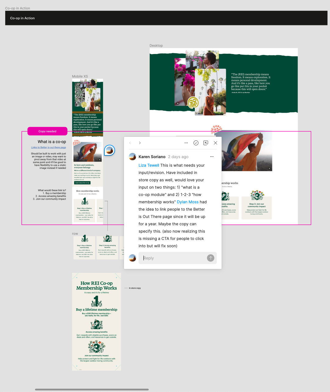
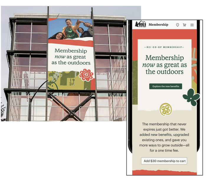
Content created for the stores was used as inspiration as we took visuals, copy and other elements from physical to digital.
My role on a new team
Upon joining the team, I found myself thrust headfirst into the complex landscape of member acquisition and engagement. Not only was this my first real project at REI, but it also marked my initiation into the world of retail UX.
Founded in 2021, the Membership & Impact team was created to serve two distinct but connected purposes:
Improve the digital Membership experience by helping customers become members and take full advantage of being a co-op member.
Support key co-op Impact initiatives and create understanding and visibility of our Membership & Impact agenda within the REI digital ecosystem.
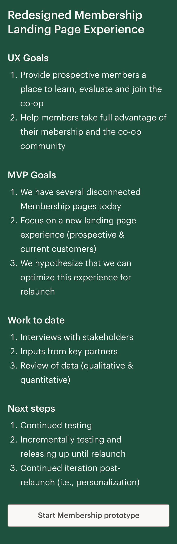

Membership relaunch
In the initial phases, my manager, who had already been deeply immersed in the project, took on a significant portion of the responsibilities. This allowed me the time and space to get onboarded, understand the project's objectives, and settle in to REI’s work environment. While many of the foundational design drafts and information architecture was already in place by the time I was fully onboarded onto the project, I worked alongside Dylan to jointly assume responsibilities for layout design, usability testing, researching, and, notably, the development of the benefits list. This collaborative approach not only distributed the workload effectively but also encouraged a fresh perspective on each aspect of the project. It was this dynamic interchange of responsibilities that allowed us to navigate the quick deadlines that approached.
I played a vital role in conceptualizing, designing, prototyping, and ideating alongside cross-functional teams.
My journey began with limited familiarity with the team, the company, and the retail sector, and our team structure was evolving.
Collaboration with various teams, including membership, brand, marketing, and merchandising partners, was essential.
Challenges
An initial pain point of our team while I was getting settled into my role was the Figma space. It was a complete mess when I first arrived. The workspace posed an initial challenge, with a cluttered and unstructured environment that hindered efficient collaboration. Over time, this became a side quest of sorts. My goal was to transform our Figma space into a centralized hub of resources and insights, accessible to every team member for their individual projects.
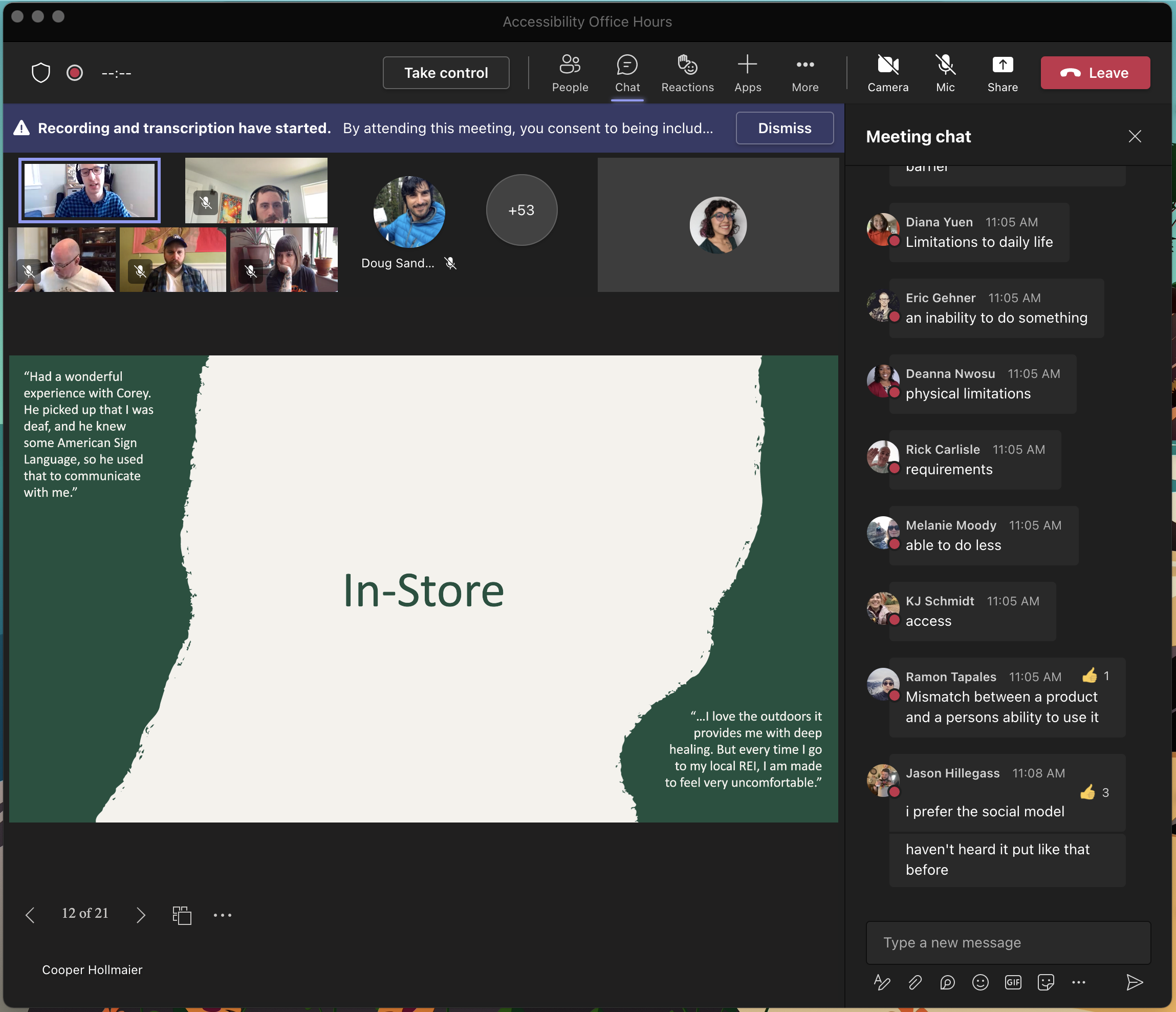
Accessibility
REI is a proponent of accessibility in the outdoors. In fact, REI got awarded Deque’s Accessibilty Culture Award for 2022. I was immediately drawn to the Accessibility Champions program at REI that meets monthly and discusses topics that are relevant in the a11y community. This program, plus accessibility weekly office hours has helped me become a better designer and consider people with disabilities in my day-to-day work as a designer.


Partnering with experts
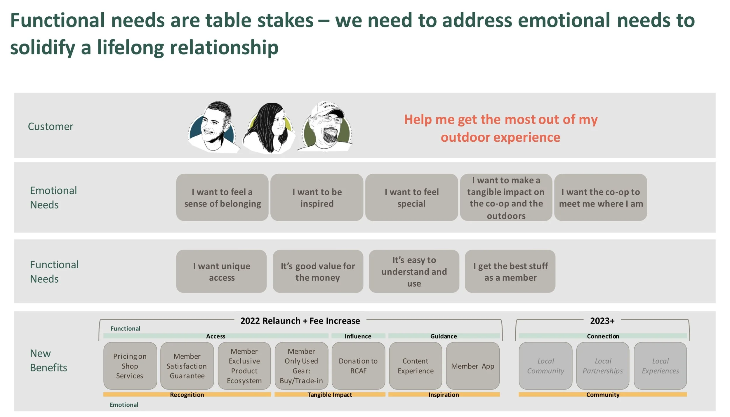
The project's success hinged on collaborative efforts with experts who helped shape the digital experience. The co-op's ethos, 'We go further, together,' emphasizes teamwork as a pillar of REI’s culture. Content designers played a crucial role in crafting compelling messaging, ensuring effective communication of membership value. Liza, a Sr. Content Designer, notably aligned digital messaging with retail stores, creating a consistent narrative. Usability testing, pivotal for direct customer feedback, was led by me, with Tom, a Sr. Researcher, providing guidance on research methodologies and feedback. Kristen, our PM, prioritized features in alignment with timelines and business requirements. This, along with other business stakeholders, including site marketers and merchandising specialists, also had inputs on the final product.
Benchmarkin’
I had to lean heavily into honing my research skills. Dylan and I collaborated on usability tests, particularly pushing forward a scrappy benchmarking methodology, to help center ourselves around how customers were perceiving new benefits on the site. At this stage of the launch, it was crucial for us to standardize our research approach. We conducted several studies during the pre-launch and post-launch phases. Each study usually involved 10-12 participants, including members and non-members and focused on a mobile-first approach. And boy, they were long! Some customers spent over 30 minutes giving us their thoughts.
(Spoiler alert: This benchmark paid off in the long run as we were able to get an idea of where our issues were, what to prioritize, and what to continue dedicating time to in the post-launch analysis).

Method/Tools used: Asynchronous usability tests on the User Testing and platform, incorporating a mix of multiple-choice questions, card sorting, and qualitative questions.
As part of the studies, we asked customers to do a card sort for benefits and group them by most interesting, confusing and least interesting while thinking out loud.
With these studies, I aimed to establish a baseline for soon-to-be membership relaunch experience. Through this research, I gained a deeper understanding of how users interacted with new layouts, and gathered insights that influenced our product. At a high level, I sought answers to 3 questions:
Are customers understanding new member benefits as we’re explaining them?
What are their general thoughts and impressions?
What are some pain points and opportunities for improvement?
Navigating hurdles
Our original relaunch approach was rooted in the idea of incremental changes in the form of A/B testing, to best measure impact. However, a challenge we faced late in the game lay in differences between our digital membership team's objectives and the brand team's objectives. The brand team understandably had a desire to create an impact by unveiling a complete gear and apparel collection launch and campaign, all wrapped up in a grand member relaunch drop. The brand team was adamant that rolling out visuals and content prematurely would diminish the element of surprise they had devised.
In response to this challenge, our team compromised. We devised a strategy that involved conducting a series of "pre-relaunch" A/B tests, where we could update key elements of the website without revealing the new visuals or content that were crucial to the brand's grand reveal. These tests allowed us to make incremental improvements to the digital membership experience without undermining the brand's desire for a big reveal.

By striking a balance between preserving the element of surprise surrounding the member relaunch and changes that could be validated through A/B testing, this approach allowed us to ensure a smooth transition for our users while respecting the brand's strategy for creating maximum impact during the launch. It was a testament to our team's adaptability and our shared commitment to delivering a successful membership relaunch. Once the designs were finalized and the timelines of what would happen when approved, it was time to begin implementation.
Implementation and QA
Collaborating closely with development and QA teams, I aimed to ensure that the designs were executed accurately and that we met standards for usability & accessibility. Clear communication and a shared understanding of goals were crucial for aligning implementation with design intent. Regular check-ins, Teams calls, and quick iterations were key to address any issues that arose during the development process. This close partnership with the devs on my team helped us maintain design fidelity and deliver a quality product. Engaging in User Acceptance Testing (UAT) from UX, content, and layout perspectives, I scrutinized try server content alignment with Figma prototypes and ensured proper functionality. The QA phase, coupled with the devs deep knowledge in accessibility helped us get the project over the finish line.

Lots of fun collaboration over Teams!
Launch 🎉
But not without hurdles. As with all product launches, challenges arose. Notably, a pricing discrepancy on the website was swiftly addressed, preventing any customer confusion after the recent membership fee increase. Luckily, it was caught pretty quickly. Imagine if a customer spotted that before we did!

Membership Landing Page of REI.com in March 2022
Post-launch insights
Membership was already short of numbers compared to last year as we were going into the relaunch on March 2nd. Post relaunch, we continued to see a decrease in all metrics (-49% memberships, -37% NMO, -246 conversion rate to plan). Our team had a couple of hypothesis as to why:
Membership demand tends to be influenced by Gear & Apparel demand, which was -12% to last year
New membership relaunch experiences and benefits were just not resonating with customers and required deeper analysis as to why
Seeing increased price ($20-$30) negatively impacted conversion rate in key areas (Side note: proven false later on in a separate effort)
Any new changes on a website may cause customer confusion and we needed to just let the dust settle
More insights
Remember that benchmark I talked about before launch? It actually helped us dig into issues, comparing and contrasting customer experiences at relaunch, and guide us through what needed to be prioritized. Highlights of these findings were:
The layout of the membership landing page was generally well-liked, but the benefits list were considered too low on the page. Additionally, customers thought the top benefits section felt confusing/redundant because they didn’t understand why they saw the same benefit in the list below.
There was a mixed response to the new Member Collection benefit, with varying levels of interest yet confusion from customers.
Confusion also existed around the concept of what a co-op even is and around membership details, with participants missing some really key information about membership: that it’s 10% back yearly, that it’s a lifetime membership, and the fact that it’s a one-time $30 fee.
The benefits list section had with some confusion around specific benefits. The Re/Supply benefit garnered high interest for its sustainability, affordability, and flexibility. However, some participants were unaware that “Re/Supply” actually refers to REI’s used gear program.
Opportunities for improvement included: better communication on the landing page through carousels, member quotes, and targeted content.
In conclusion, the benchmark provided valuable insights into user perceptions, indicating areas for refinement in the membership program.
Actions to take
As we continued to watch, learn and monitor how relaunch played out within membership, some immediate steps were crucial in course correcting:
Content testing with enhanced efforts to explain membership details better
Addressing confusion about benefits
Optimizing the layout for a better user experience
The re-evaluation of benefit hierarchy
Develop high-level “what is a co-op” content that more specifically explains what REI is and the concept of a cooperative.
Once we’ve got a grasp on basic changes, continue developing new content strategies tailored to each audience type.
Content audit
One of the root causes identified in research findings after launch was that human-centered design practices hadn’t been incorporated into its creation throughout the organization. So, messaging may not have resonated as strongly.
Original launch messaging wasn’t tested, felt passive, and it wasn’t necessarily clear who the membership is for or what value it provides. Benefits are vague and differentiation is buried (e.g., lifetime, one-time fee). Examples of this vague language included:
“Membership now as great as the outdoors”
“One membership, a lifetime of boundless discovery”
Low numbers after launch created urgency and the opportunity to try something different, so we partnered with the content team to hone in on language and generate better membership sales.
The result? Stronger customer-focused messaging!

Conclusion
Our initiative included the relaunch of the membership program in 2022, introducing new and improved benefits. Membership struggled that year and, unfortunately, we didn’t see an influx of memberships as a direct result of member relaunch. However, it brought many opportunities forward for us to test and learn into content and experience enhancements to help drive membership as one of the co-op’s top priorities.
In redesigning the membership experience on REI.com, our team had successes and challenges. Despite struggles, relaunch contributed to our growth and expertise in creating a more test and learn digital environment. This major initiative breathed new life into the digital experience for new and existing members, marking a success in starting to enhance the membership journey.
Fast forward to 2024, top benefits even have their own dedicated pages and important content that stemmed from this initiative is prominently featured around REI.com, Additionally, we've created new and relevant pages to address common questions about the changes and continuities within the membership experience.